

De Koffiejongens
Rebranding the rising star of fair and organic coffee in the Netherlands
The challenge
De Koffiejongens grew up as an online subscription brand, delivering organic coffee capsules to the doormats of over 30,000 subscribers across the Netherlands. Its identity was designed to stand out from the predictable labels in the coffee industry. Light pastel colours and kraft paper packaging made the brand recognisable, and it was one of the first in the Netherlands to offer fully compostable coffee capsules.
In 2025, the brand moved into retail, but the packaging didn’t evolve with it. On the shelf, next to competitors fighting for the same three seconds of attention, it lacked readability, and the soft pastels faded away against the dark packaging that dominated the category.
Our challenge was to develop a packaging system that performs in retail and builds recognition with a wider audience, while feeling like an evolution rather than a new brand. Because the people who made this brand big are loyal, and we couldn’t afford to lose them.
Who they are
De Koffiejongens is a fast-growing Dutch scale-up selling organic coffee in compostable capsules and as whole beans. The coffee is grown in Africa, Asia and South America, between avocado and banana plants, by local farmers they know personally and buy from directly. On top of that, the coffee qualifies as specialty coffee for its taste and quality.
That makes them a brand doing good across the entire coffee chain: organic beans, honest pay for their farmers, sustainable packaging and high quality coffee.
What wasn't working
We started with an extensive analysis of the existing identity and packaging. While respecting the image that built the brand over the past years, we quickly came to the conclusion that major brand elements needed a refresh.
The capsule packaging made the problem visible: large amounts of white space, small typography, and a lot of text with almost no branded elements. It didn’t reflect what makes De Koffiejongens special.
The logo also had a somewhat outdated look and was poorly aligned, which made it hard to achieve the timeless feel we were after. That became the first thing to tackle.
The logo
We sketched a new logo following the layout of the existing one, but corrected the alignment and modernised the lettering based on the font Futura. Because Futura is already the main typeface in the identity, the result didn’t feel like a different brand to the founders. Built on the same structure as before, it read as an evolution rather than a replacement.
Alongside the Netherlands, De Koffiejongens also launched in the German market. Because De Koffiejongens is a Dutch name, we recreated the logo for the German name following the same guidelines, creating a cohesive identity across international markets.
Typography
Because keeping the loyal customer base was a requirement, we kept Futura as the headline typeface, but set clear rules for how it’s used: bold and capitals only, to give it the weight it deserves. Alongside it, we introduced Agrandir Narrow, which adds modern contrast, playfulness and character to the overall typographic hierarchy.
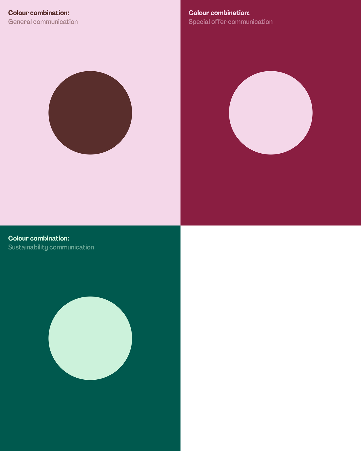
Colour system
The brand already used colours to separate the flavours. We kept that system, but added more vibrancy to the existing colours, which had become dull and faded, while staying within the established codes.
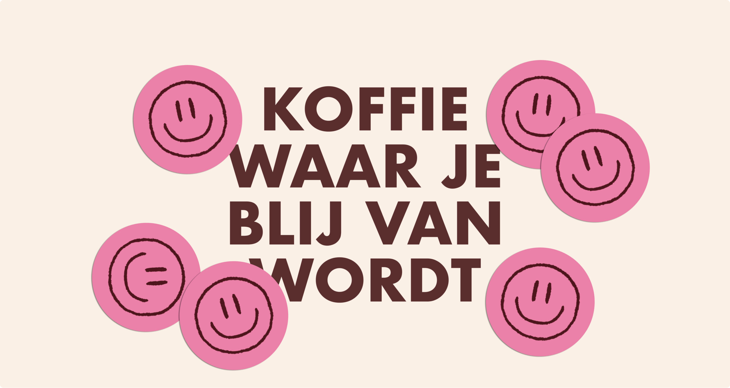
To protect recognition, we kept the pink at the centre of the brand and adjusted it slightly so it sits well with the rest of the palette. For the typography, we dropped the harsh black and replaced it with a “roasted coffee bean” brown. It adds warmth and richness, and as a colour taken from coffee itself, it ties the vibrant palette back to the product.
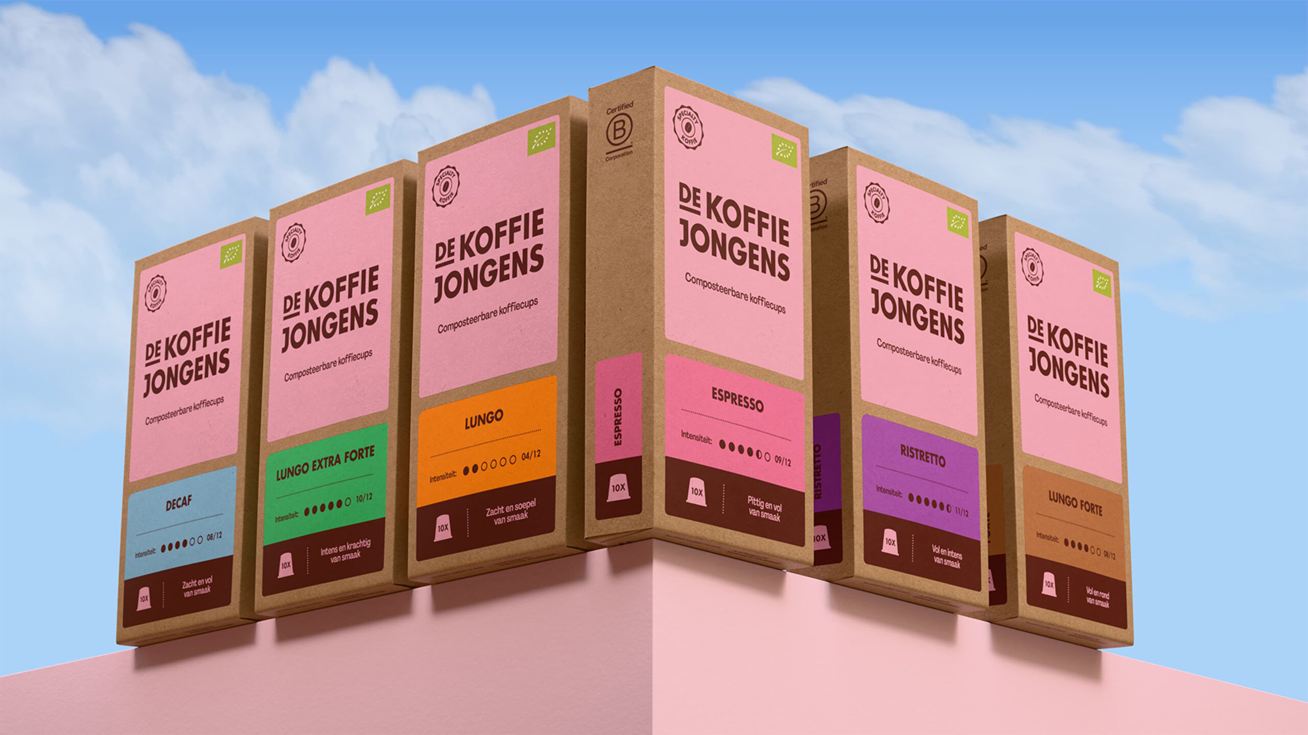
The packaging system
Research conducted by De Koffiejongens themselves showed that most of their customers actually liked the kraft paper the brand had built its recognition on. Their audience is loyal, and surprisingly, mostly people in their fifties. Many of them found the brand through targeted newspaper ads. So when they approached us, the brief came with a clear condition: don’t lose our customers.
We wanted to develop a system that is flexible and works across the full product range. Because the brand is rooted in the digital world, we subtly brought that world into the system, while designing for the shelf.
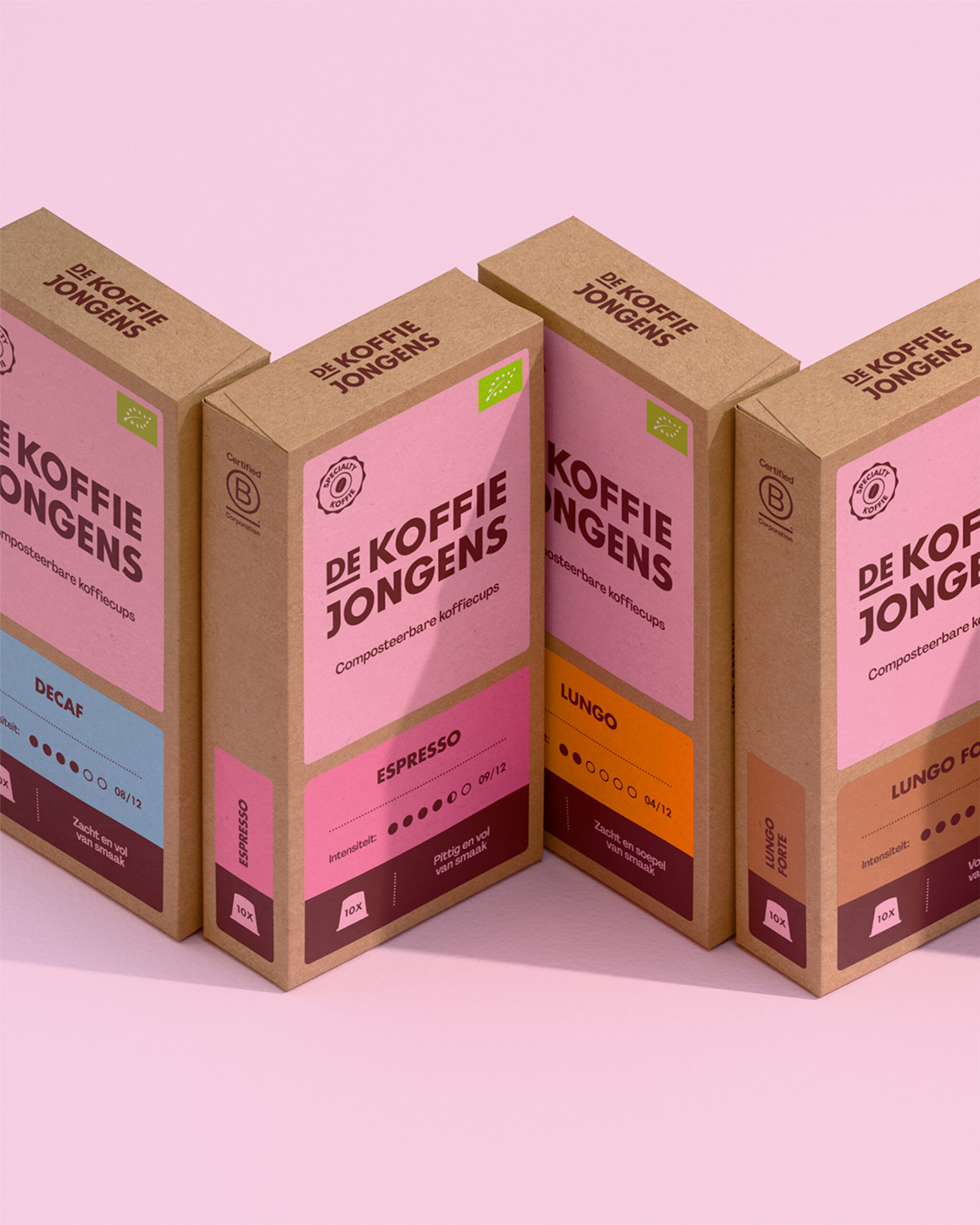
Our solution was to split the front into two sections using Fibonacci ratios. The larger top section is dedicated to brand recognition and carries what stays the same across the range: the logo, the specialty coffee label, the European organic certification, and the product description. The lower section belongs to the flavour.
On the old packaging, the recognisable pink brand colour was missing, creating a disconnect between the brand online and the brand in retail. Now the top section sits on a pink block that immediately draws attention and makes the brand instantly recognisable.
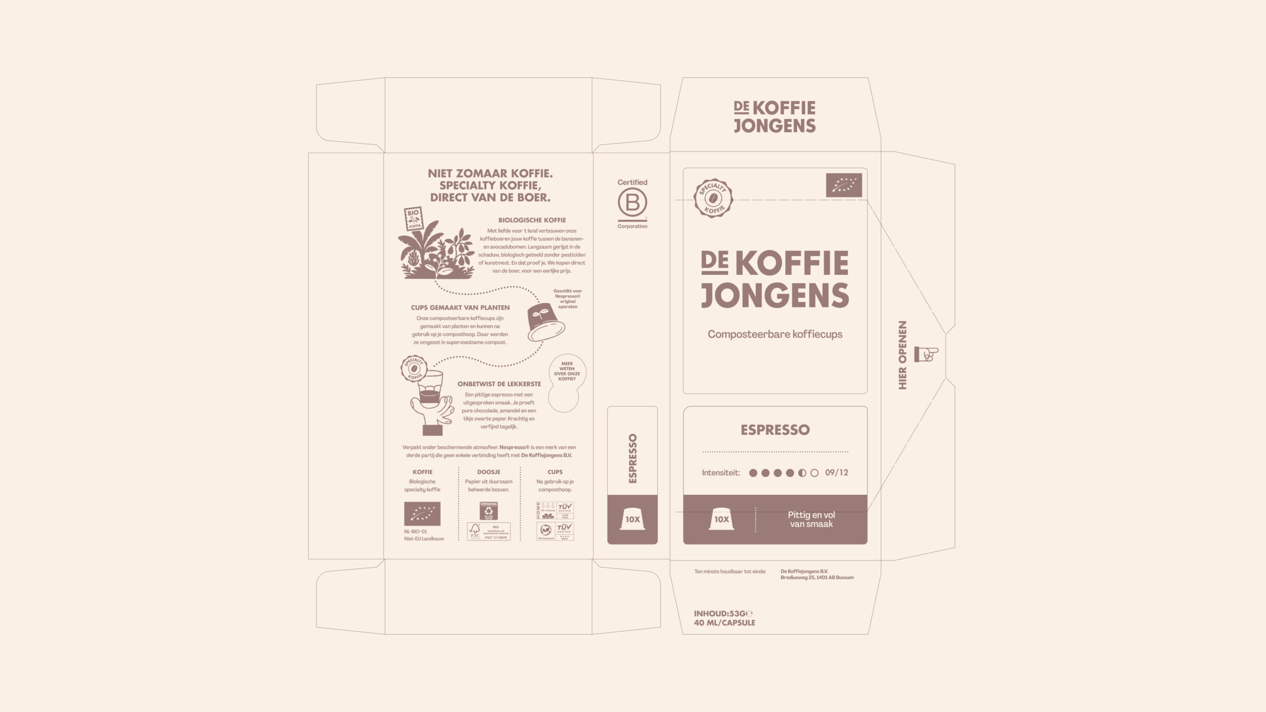
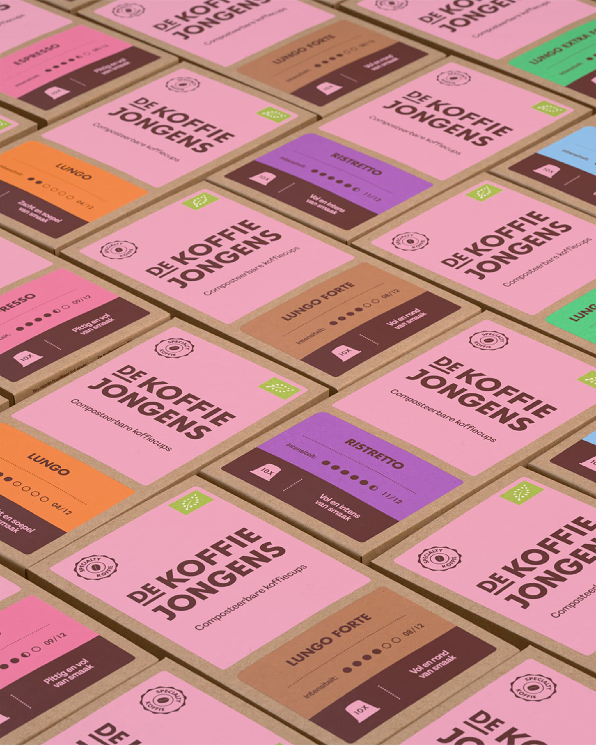
The flavours are separated by the colour system, so they can’t be missed on the shelf. At the bottom of each flavour block sits the roasted coffee bean brown, representing the soil. The coffee grows in it, and the circle is complete when the used capsule goes back into it.
To tell the story of the De Koffiejongens coffee chain, we illustrated the journey the coffee takes, from the bean growing in the jungle to the coffee in your cup. We developed a hand-drawn illustration style that complements the vibrant feel of the brand.
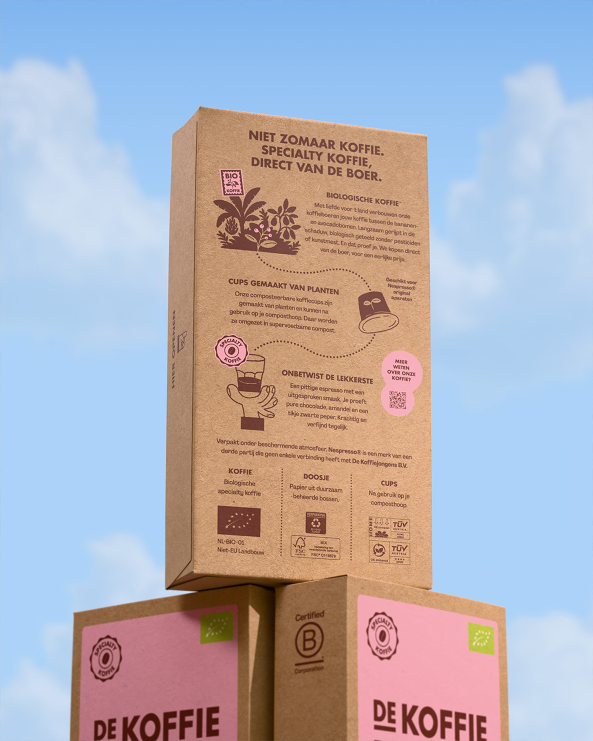
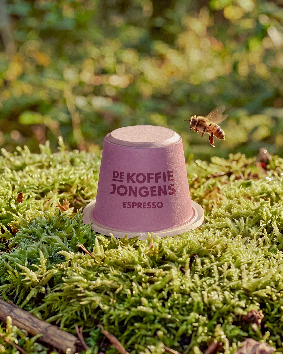
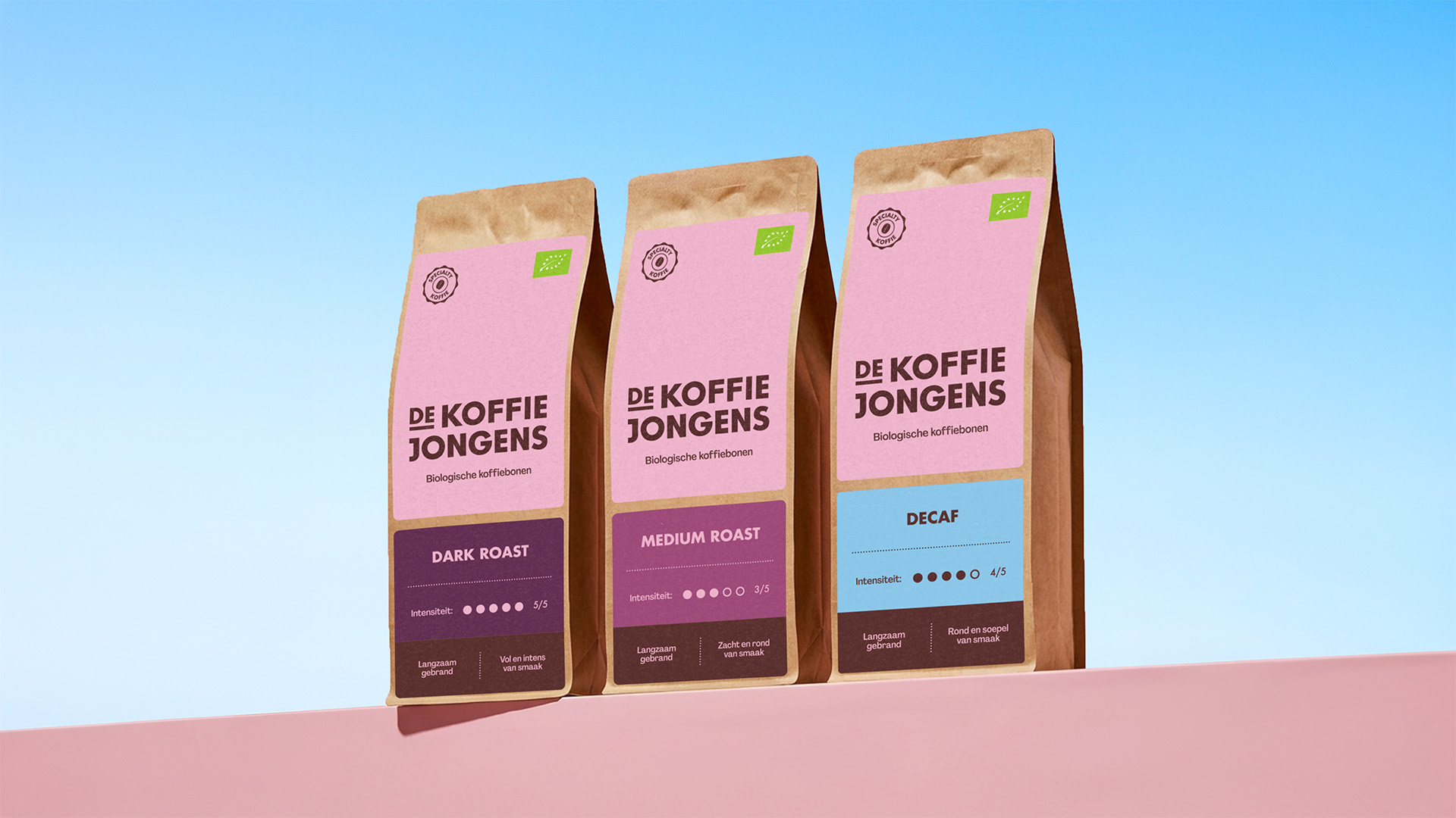
Because the packaging system is designed to be responsive, the whole bean packaging fits seamlessly into the rest of the range. It’s recognisable as a separate product, while clearly part of the same brand.
Tone in use
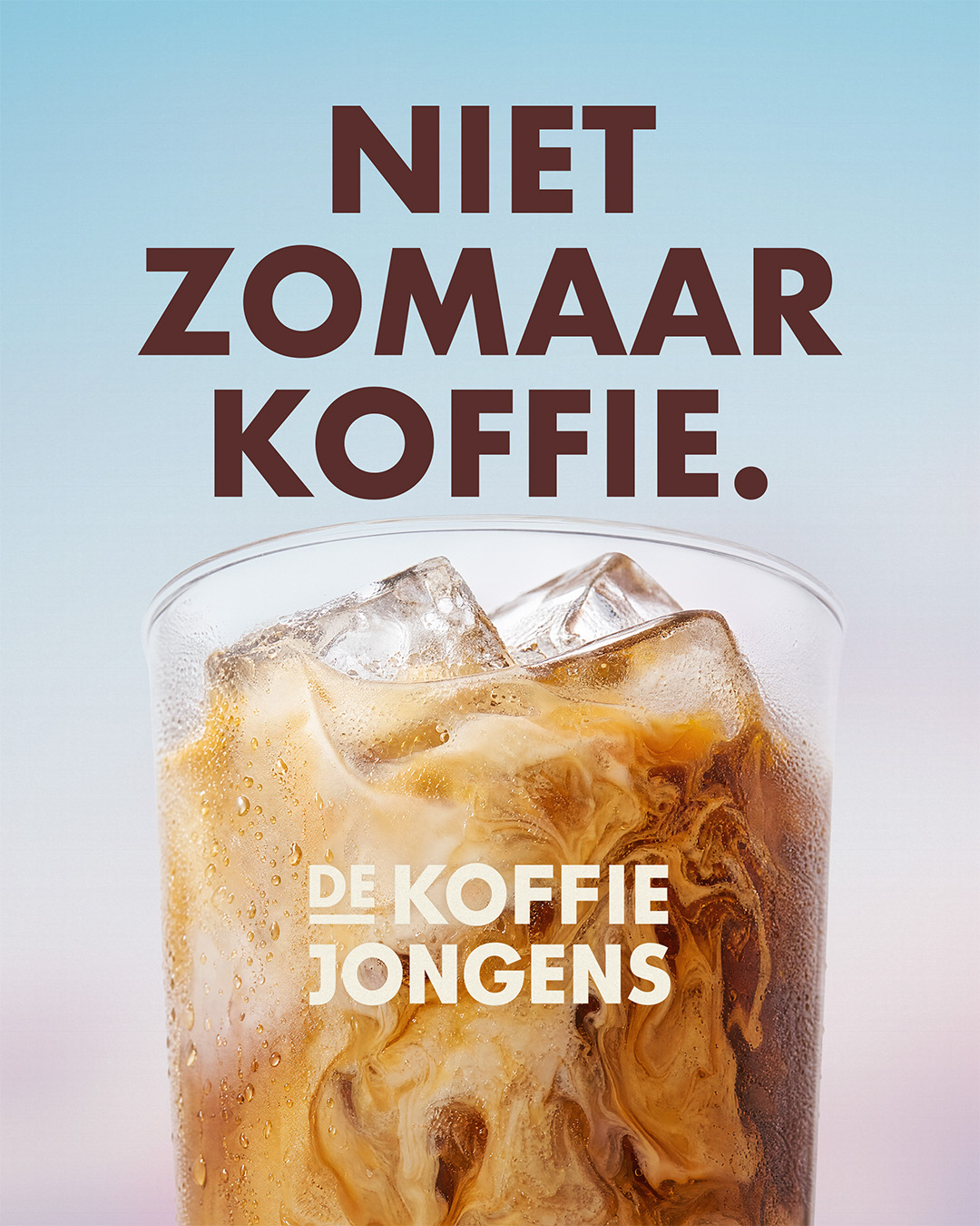
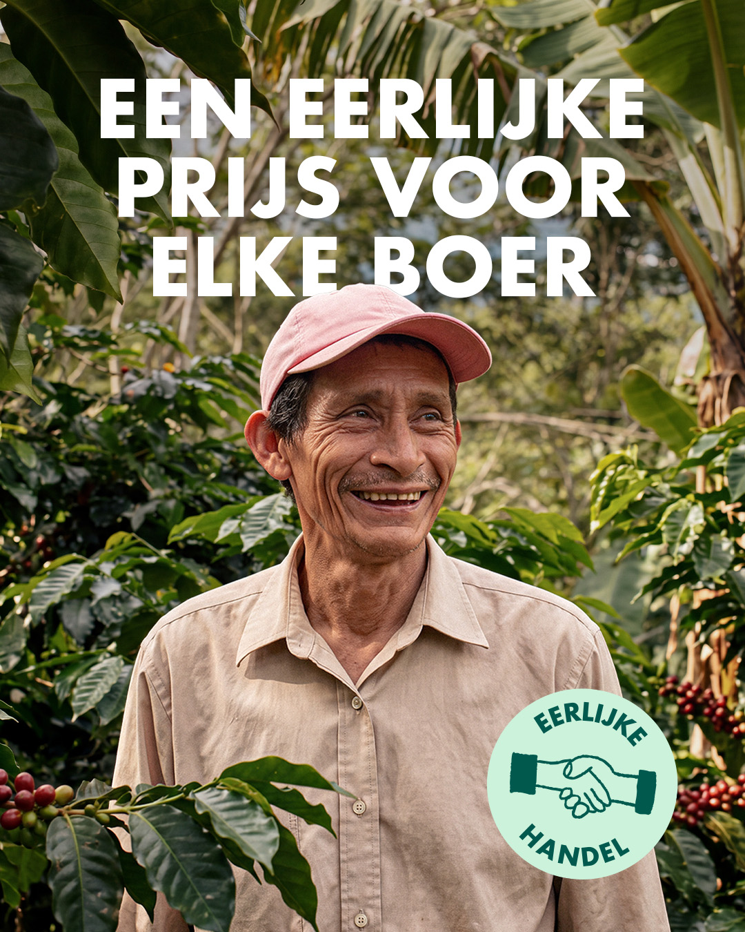
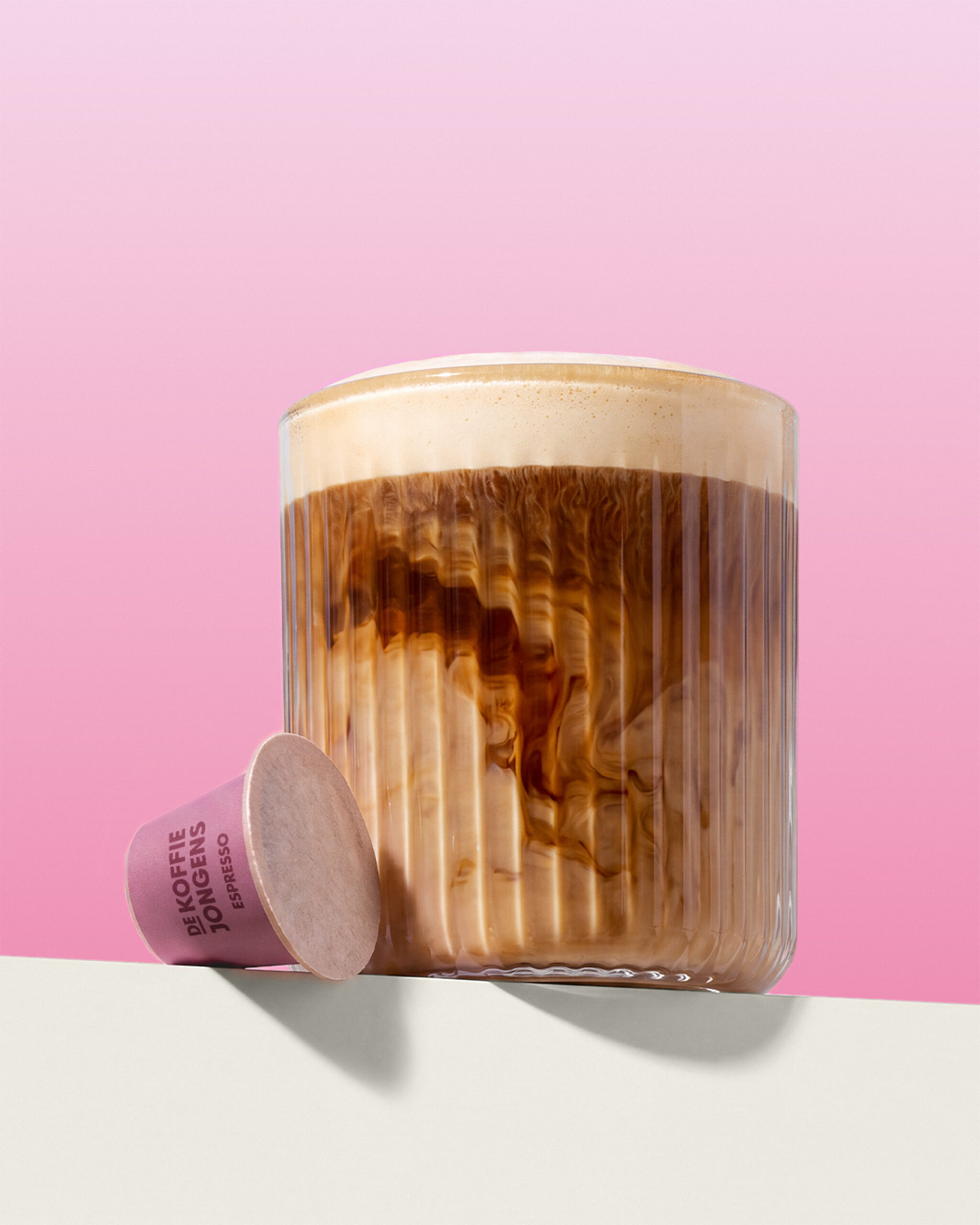
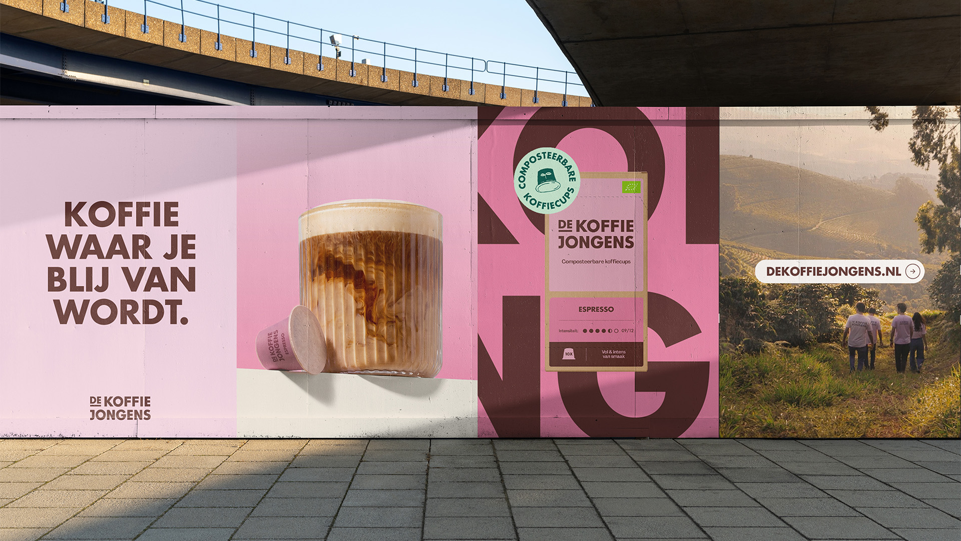
Beyond the packaging, we developed a dynamic identity that works across online and offline marketing, such as digital ads, OOH campaigns, merchandise and social media. To communicate different topics, we gave each its own use of colour within the assets, supported by labels.
The art direction combines vibrant studio photography to promote the product and documentary photography for storytelling, highlighting the people and process behind the coffee.
The result
A packaging system that holds its own on the shelf. The vibrant colours and clear structure make every flavour easy to find, while the familiar pink, Futura and the brand’s warmth make it unmistakably De Koffiejongens across the entire range.
The new identity tells the full story of the coffee, from the farms where it grows to the soil the capsule returns to. It works across capsules, whole beans, two markets and every channel the brand uses, giving De Koffiejongens a foundation to grow on in retail.
The new packaging launched in mid-September 2026 in more than 900 Albert Heijn stores across the Netherlands.
Other case studies
Pal & Leo
A new look for a South American healthy granola brand, helping it launch in the European market and secure high-quality listings.
Soupenzo - Coming soon
A brand refresh for a food icon of Amsterdam, building on 25 years of legacy with a new visual identity and website.
Start a project
For project inquiries reach out to timo@neverthought.studio
or call +31 6 27 50 87 68